1) Initially, I expected to learn about art origins, and how to appreciate art more...these goals were met and exceeded.
2) I thought art was just looking at paintings, now i realize art can take many forms, for ancient sculptures to modern abstract painting, to something as strange as drip-art . Art appreciation is in the eye of the beholder, based on individual value judgements.
3) I did not have a favorite artist before this class, never really though about it. Now, my favorites are the classics. The effort and beauty of Michalangelo's work, and the Greece and Roman sculptors, are still unmatched in my opinion.
4) This on-line class was much harder then i expected. A lot of work, but I also learned a lot that I did not think I would.
Sunday, December 12, 2010
Thursday, December 9, 2010
Week 15 Self-Portrait Blog
Went to the A-Knox museum to find some self portraits. The first picture is "Self-Portrait With A Monkey", by Frido Kahlo, from Mexico, 1938, Oil on Masonite. The second is "Monsieur X" by George Rouault, from France, 1911, oil on paper. The third picture, I thought I should include a famous Van Gogh self-portrait off the internet. The fourth picture is one taken of me at the dinner table. I selected my inspiration pieces at the A-K museum by finding and taking a pic of the famous monkey picture by Frido Kahlo. I selected simple pencil and paper to do my self-portrait, the biggest challenge is that I am not a good artist. Maybe I should have done abstract, but the way i overcame the challenge is to use my photograph as a guide. The elements I used were mostly lines and shapes, and shading. How are eyes and teeth made to look realistic? In the end, it was kind of fun doing this, and it came out OK.


Sunday, December 5, 2010
Week 15 Criticism Reflection Journal
Written Reflection After Evaluating:
I enjoyed doing the critique. I looked carefully at each item in the exhibit, trying to find elements of art in each painting or sculpture. I wrote comments on about 2/3 of the paintings. I think the exhibit was excellent, with a few small changes that i mentionned. I am an easy grader, I give it an A !
Written Reflection Before Evaluating:
I took a look at 3 art projects to determine which one I wanted to download, then do the critical review of it.
The first one I opened is "Wildlife Encounters", by Willie Wimes. This is a pretty impressive powerpoint exhibit, all about animals. He used some nice background gray, I should have done that. The pictures all look good, with references, a nice job.
The second one I opened was "Gruppo Project #4". It was "Art in the Life of Trees". by Katie Gruppo. She looks to have followed instructions exactly, with references, and also Interpretation and Explanation. There is some old work, new work, abstract work. She does a real nice job with display and interpretation.
The third one is "Abate Project #4". , the title is "Youthful Innocence Caught In The Moment", by Abbey Abate. A very professional exhibit, with title, author, date, medium, style, and the interpretations included. Sweet dreams is appropriate as the final slide. A real nice job.
But I am going to select project of "Wildlife Encounters" to review. I like animals, and I liked looking at those pictures. I cannot get very excited about trees, or little kids blowing bubbles. So I will try to look close at the animal exhibit and apply what I have learned. I just made a value judgement to help decide and pick that exhibit. The challenges I face is that all the slides pretty much show the same thing...how do I make different views of each slide, or maybe I do not have to. I don't mind critique my peers work, I am am easy grader! I am not sure if I want to read anybody who reviewed my work, because I think they did a better job than me.
Week 15 Video Review Blog
Below are the reviews from 6 videos for week 15. I learned some things that can be used in my art criticism assignment. There is really an 'eye test' that must be passed to qualify art, that means personal value judgements can be used. I like that the way to be a critic is be properly trained, that is to write, write, and then write some more.
1. Greenberg on Art Criticism, and Interview With T J Clarke. Clement Greenberg says that "writing about visual art is much tougher than writing about literature or music". Greenberg thinks the best art in the last 50 years has been abstract art, ever since America's culture boom in the 1940's. Great past critics like Ruskin and Sylvester were not philosophical, but used value judgements, like using intuition. They discuss value judgements in modern criticism.
2. Greenberg on Pollack, an Interview with T J Clarke: Greenberg and Clark discussed Pollack 25-years after his death. Greenberg likes Pollack's practical approach, even though it was greakish, from the mid-40's on. Pollock claimed his technique of drip-art the the "end of easel painting", but it was not actually true. Pollack moved away from containment and orderliness. Greenberg says that some of Pollack's works indeed failed the "eye test", a value judgement. Pollack ultimately realized his work would not be accepted as true painting by the historical view.
3. An Introduction to the Italian Renaissance, by Giorgio Vasari: Giorgio Vasari wrote "Lives of the Artists" in the 16th centruy, probably the first actual art criticism. All the great masters developed techniques passed on to them from the work of previous artists. Vasari reveals the innovations of old artists Griotto, DaVinci, Michalangelo, and others. Vasari did a lot of interpretation of the works of the artists in his criticism.
4. The Critics: Stories From The Inside Pages: Dr. Dwight DeWerth-Pallmeyer took an in-depth look at art criticism as an art form, including social value, and their individual careers. He interviewed famous critics like Joel Siegel, Richard Schickel, Bill Friskies-Warren, Maureen Corrigan. Critics are supposed to get us to think, and to 'light the way', for books, movies, art exhibits. But effective art criticism takes logic, emotional support, and personal credibility. The key to training to becoming a good critic is the write, then to write, and then to write some more.... a good philosophy.
5. The Colonial Encounters, Views of Non-Western Art and Culture: The 1900 Paris Workd Fair was an example of how the Western world was prejudice against underdeveloped countries. They did not seriously include art from anywhere outside European culture. The African Dahome art was not taken seriously, and mostly French art was on display for the exhibit, even though it was a "world fair". Colonialism in Africa was portrayed as justifed with the images shown in the exhibit. Racism and colonialism was running wild in those days, for both black Africans, and also northern Africans, like the Algerians.
6. Jackson Pollack: Michael Fried and T J Clark in Conversation: Fried and Clark have argued in the past about art criticism. They discussed two of Pollack's works, and tried to find some common agreements. They reviewed "Lavendar Mist" and also "Autumn Rhythm". They both agree that Pollack is an important artist, but with a lot of negatives about him. They agree on his value for different reasons. They argue about action in art, value in art, and optical and tactical aspects. But they both are committed to a historical way of looking at art, but Pollack's work, unfortunately cannot qualify as historical art. There lies the problem with judging Jackson Pollack.
Saturday, November 27, 2010
Week 13 -14 Project #4 Reflection Journal
Almost done with the project. Seems like all the old Greek bronze sculptures ended up getting lost, decaying, rotten, and being melted down for the metal...but many of them were copied in marble by the Romans. So a lot of my pics were actually Roman reproductions of the original Greek bronze art. Also, a lot of my report may seem to be a history lesson, since so much of the Greek artwork is part of our history, and even our pop culture. I am also having a little trouble with PowerPoint formatting.
I am mid-way through the PowerPoint project #4 art exhibit presentation. Working on ancient Greek sculpture. My best souces of artwork are Google search, with Images. I use "Ancient Greek Sculpture" in the search engine. That shows a lot of pictures of sculpture. From there, I can get the name of a sculpture, then usually go the Wikipedia for more details. The problem is that a lot of this old sculpture does not have a specific date and artist for it, it's too old. Just a general time frame, like 100 BC. Also, as it turns out, these old Greek bronze statues did not last very long, and many of them were copied in marble, by the Romans, and the originals were melted down for the metal value. So a lot of my pictures are simply the Roman copies made of marble, not bronze.
I am mid-way through the PowerPoint project #4 art exhibit presentation. Working on ancient Greek sculpture. My best souces of artwork are Google search, with Images. I use "Ancient Greek Sculpture" in the search engine. That shows a lot of pictures of sculpture. From there, I can get the name of a sculpture, then usually go the Wikipedia for more details. The problem is that a lot of this old sculpture does not have a specific date and artist for it, it's too old. Just a general time frame, like 100 BC. Also, as it turns out, these old Greek bronze statues did not last very long, and many of them were copied in marble, by the Romans, and the originals were melted down for the metal value. So a lot of my pictures are simply the Roman copies made of marble, not bronze.
Wednesday, November 24, 2010
Week 13 and 14 Video Review
Video review of the 4 videos for week 13 and 14. Videos were good, but I probably will not use the format for my PowerPoint. Most exhibits do a chronological order of artwork. My PowerPoint will be of Ancient Greek sculpture, and in my opinion, cannot be done in chronological order. But I did learn from the videos.
George Eastman House: Picture Perfect: By creating the first affordable, user-friendly camera, George Eastman became the father of popular photography. The museum established at his home celebrates his contributions to advance the art and science of photography. The photography collection at George Eastman House is a history of photography that represents the work of 14,000 photographers. The technology collection at George Eastman House contains about 16,000 objects, including about 5,000 cameras. The Eastman House holds the largest Daguerreotype collection outside of France. George Eastman worked to make photography accessible to everyone; he created the first affordable, user-friendly camera and founded the Eastman Kodak Company. Eastman's "Brownie" camera revolutionized photography, and the motion picture film he invented with Thomas Edison became the industry standard for movies. The 50 room colonial estate George Eastman began building in 1902 serves as the centerpiece for his museum. In addition to photography-related artifacts, the museum houses many of Eastman's personal possessions. Today the George Eastman House is one of the world's premiere motion pictures archives. In 1996 the George Eastman House established the first school in North America to teach the restoration, preservation, and archiving of motion pictures. The George Eastman House offers a variety of means to access collections, including 140,000 online images, that celebrate the art, technology, and impact of photography and motion pictures.
The Lowdown on Lowbrow: West Coast Pop Art:
Artist Anthony Aussang says Lowbrow, West Coast Art, is essentially a reaction to highbrow culture. The dictionary definition of Lowbrow is, "a person regarded as uncultivated and lacking in taste”. Artist Robert Williams says he invented the term but doesn't care for its meaning. Some believe Lowbrow Surrealism is a more fitting term while others embrace just ‘Lowbrow’. Lowbrow art appeals to the masses. Pop culture, car culture, and folk art have both had major influences in Lowbrow. Robert Williams, the original Lowbrow artist, discussed his early career as a Lowbrow artist. At a time when galleries were not willing to display Lowbrow, the Laguna Art Museum put on a show featuring Williams and others. MAD Magazine had an impact on Lowbrow art culture. Artist Anthony Ausgang says, "Lowbrow blitzkriegs the idea that high culture requires a certain level of intelligence." Robert Williams thinks the established art world is set up to promote only certain types of art like minimalism and abstract, and the mainstream world will not accept Lowbrow. These unaccepted artists created their own art scene after being shut out from museums and galleries. The punk rock generation propelled Lowbrow art culture, with album covers and fliers. Artist Nicole Steen and other members from the Pop Tarts discussed the parallel underground art scenes in Vancouver and California. The Pop Tarts gained more recognition and acceptance after being featured in a book about female Lowbrow artists. Twenty years ago Robert Williams couldn't get anyone to show his art work, and now he is in demand all over the world.
Bones of Contention: Native American Archaeology: Native Americans' bones were collected as a scientific curiosity during the U.S. genocide against Indians. Anthropologists differ on whether or not the bones should be returned now. Dr. Samuel Morton studies brain size and concludes that the size of one's cranium is related to intelligence, and he stores Indian skulls in museums. The Smithsonian's inventory shows 18,000 Native's bones are stored there. Repatriation requires that scientists first determine the bones tribal affiliation. Skull measurement helps to identify where the bones should be returned. Scientists learn a lot about today's health problems by studying the remains of human beings from the past, including Indian remains. Bruce Rothschild, an arthritis researcher, theorizes that arthritis is a new disease whose trigger may come from the Tennessee River region. British researchers claim research helps understanding how man changes from the ancient to the modern man. For example, changes in Indian diet and lifestyle is related to high rates of diabetes. Dennis Hastings, an Omaha Indian, is satisfied with the reburial of his ancestors' remains. Both the tribe and scientists have gain new knowledge by having the bones analyzed prior to burial. Now, Native Americans design the exhibits in New York's Native American Museum. Ancestors' bones continue to be brought home and re-buried.
Displaying Modern Art: The Tate Approach: Modern art in the Museum of Modern Art from 1929 onwards was displayed primarily in chronological order. Art is displayed on white walls with lighting. By the 1970s, traditional ways of displaying modern art are questioned. Art came became busy and noisy. Artists explored the political and ideological context of the museum itself. The Tate Modern displays its modern art in four sections. In each section a principle provides a theme for the selection and exhibition of the art. The Tate's thematic approach to displaying art is controversial with three works by Richard Long and Monet's "Water Lilies." But the connections among the artwork is justified . Unlike the Museum’s original concept of displaying art in chronological order, visitors to the Tate are provided with transitions between the individual display rooms. Many abstract artists tried to convey emotions, aesthetic effects, or social vision. The Joseph Beuys room in the Tate Modern creates a church-like atmosphere. Visitors do not materially understand what they see. They transition to the next room where art consists of waste and junk.
Tuesday, November 16, 2010
Week 12, Review of 4 Videos
I reviewed 4 videos. It was all about Andy Warhol, the other 3 videos were just random selected. I learned a lot about Andy Warhol, he was really a trend setter, a good video. I did not like the videos of Isamu Naguchi, way too much talking. I did not like the Mark Rothko video, I just do not see how he could be considered such a great painter for his work. Pop art of the 50's and 60's video was good, I like the comic book paintings.
1) Andy Warhol started out in the 1960's working for advertising, but was experimenting with advertising images such as the soup can. He did a lot of silk-screen work with Marilyn Monroe in 1962, especially after her death. He did a lot of work with Elizabeth taylor in 1961-1963, especially after her breakup with Eddie Fisher. Andy would crop pictures to silkscreen. He did "10 Lizes" of Liz Taylor. He made a lot of money reproducing silk screens. He moved into a studio called The factory, a cool hangout for artists. Warhol filmed about 100 movies, and made some people famous. He said "everyone will have 15 minutes of fame". A true leader in pop art, he also did dozens of self-portaits.
2) Isamu Naguchi had a vision, that the earth was sculpture. He sees sculpture as different than painting. His vision led him to create gardens with stone, hills, water, such as the UNESCO garden in France, a beautiful job. Noguchi started under scholarship, then had to sculpt to make a living. He designed Miami's Bayfront Park in 1980, but had problems with the existing building, so he destroyed a library. he did a water sculpture in Osaka for expo 1970. He did the Billy Rose sculpture in Isreal, perfect for the area, with a large circular wall and 3 hills. His final work was in 1988 for the 400 acre Moere Numa Park in japan. Naguchi was famous for Land Art, or Installation Art.
3) Mark Rothko was an abstract painter. Being an abstract painter in the 1970's was not easy with Andy Warhol leading the pop art scene. Rothko was called the "Greatest Living American Artist", but i do not really see it. He was hired to do the art for Seagrams' headquarters, but he never had his work displayed there. He hoped his work would make the restaurant customers sick! He did the subways series, a strange doomed look at subway people. His paintings gave feeling of human tradegy. His murals were just colors of various tones. They are meant to evoke extreme sensations. Eventually, Rothko's drinking, smoking, divorcing, and too much competitio from PopArt, led to his suicide. His last works were in black and gray, very depressing.
4) Abstract expressionism and Pop Art of the 50's and 60's. American Franz Kline is an abstract artist, he likes to display mood and expression, and also likes colors and shapes. Helen Frankenthalen did "Mountains and Seas" and influenced other painters with the subtle effects of her work, which was very feminine and mystical. She painted with a cotton cloth. DeKoonigs abstract paintingwas "Morning: The Springs" which give a feeling of light, and falling water. DeKoonig also did "Woman One", which shows dominance by women, and he had hundreds of rejected versions, and became an action painting. I like the "Flag" by Johns, a strange way to show the flag. Andy Warhol is pop art's most famous artist, but the father of the movement is Robert Rauschenber. Pop art reflects modern city life. I like the Lichtenstein artwork that uses comic book forms.
Saturday, November 13, 2010
Week 11, Visit to A-Knox Museum
Visited the Albright-Knox museum this week to take 3 pictures of interesting art presentations.
The first one that I liked is called "Bably Girl" It was was done by Marisol in France, in 1963. This sculpture is listed as a 'wood and mixed media sculpture'. This exhibit just sticks out in the open, not special area. The background is just plain walls, sitting on the floor. I have an open mind, but it looks like something high school students can make. There is a large head of a little girl, then a small doll on her leg. Maybe it is supposed to mean that the little girl is doll-like also, even though she plays with dolls. I like the lighting on the girl's legs, to show off the small doll. Shape and Mass are important here, i am curious why the shape of the little girl is a square, instead of soft corners.
The second picture is "Still Life" by Tom Wesselman, from the United States in 1962. The theme is a everyday scene in someone's house, in the kitchen. The exhibit is organized like a house. The artwork is listed as a mixed media sculpture. What's interesting is some of it is 3-Dimension. But the sink is very old, like the 1960's, nobody has sinks that bad in their house these days. Some old soap, SOS, and other everyday random things in the cabinet. The artwork of the bread, bananas, and pop is painted on. An interesting mix of 3-D and 2-D. The lighting is very bright over the sink. The element of light, color, and lines are important. So are proportion and scale with the 3-D coming at you. I liked this display.
The third artwork is "Cinema" by George Segal in 1964, from the United States. The media is plaster, illuminated plexiglas, and metal combined in a sculpture. This is really a cool piece of art. The exhibit setting is very dark, so this makes the art really show up better. The lighted up movie display is very bright like Broadway, and really catches your eye, and it makes you stare at it. The walls are just basic plain walls. The man is putting, or removing, an rated R label. The sculpture of the man is kind of spooky, with the plaster look to him...that should have been done more realistic, since the rest of the art looks realistic. CINEMA is faded a bit, for an effect of age. Light and Value are important elements of this piece.


Wednesday, November 10, 2010
Week 11, Blog of 4 Videos
I reviewed 4 videos. The videos on Dada, Cubism, La Grande Jette, Dance at Moulin. The first two were OK, but I really loved the "Sunday at the Grande Jette" and "Dance at the Moulin de la Galette". I'd like to go out and buy those last two prints! They were great. The videos did what the book could not describe. This time, I just picked 4 videos at random.
1) George Seurat's masterpiece was "A Sunday on the Grand Jette". This is an absolutely beautiful picture, it can be stared at for a long time. It is very inviting, it makes you want to jump inside the picture. One mystery is the monkey in the picture, nobody knows what it is doing there, but people like it. An x-ray shows that the monkey was added later for some reason. There were also some suggestions of prostitution in the picture. The technique Seurat used was Pointillism, a lot of work to create. It was difficult to blend colors with Pointillism. The painting was displayed in 1886 with the impressionists, but was mostly ignored. Seurat's career was only 10 years, then he died. The Grand jette is now in Chicago, and it is part of Pop Culture.
2) Renoir's masterpiece was "Dance at the Moulin de la Galette". It stands for pleasure in Paris, and transports you back in time to Paris. It was sold for a very high price. It is a scene from a dance hall in Paris, a lot of young people having fun. Renoir painted it twice in 1876, doubling the size, but which size came first, nobody knows. The small version is in hiding somewhere, and it sold for 78 million bucks. Renoir brought bright colors, changing light, and fun with dance. the painting eventually entered pop culture, being in Rod Stewarts album cover in 1976. Renoir would be happy since he wanted art to be seen as 'pretty'.
3) Dada Surrealism: This Dada movement was started by Kurt Schwitters in 1918 with a collage, using a lot of everyday objects in it. His magazine was Merz, to include his work. Dada is a state of mind, a storm in the world of art. "Cut with a Kitchen Knife" by Hoch was done out of anger to society. George Grosz made an angry 'sad' man, and protests Germany with 'Pillars of Society'. Joan Miro did Dutch interior 1 and 2 with a lot of color in it. Salvador dali started surrealism, sometimes scary imagination is seen, and his 'sleep' sculpture is weird and surreal. Man Ray did some beautiful surreal paintings.
4) Impact of Cubism: European artists had a non-classical way to represent form and space with Cubism, infleunced by African Art, and Cezanne. Juan Gris, Picasso, DuChamp, Delauney, Malevich, Boccioni were all Cubism artists. Gris did 'The breakfast table', and the 'Violin'. Duchamp did 'Sad man on a Train', but I cannot see the man, too messy. I liked the pole vaulter photos of motion. Delauncy shows a strange Eiffel tower, hard to see it. Kasmir Malevich did an 'Englishman in Moscow' and the 'White Cross'. Boccioni did 'Farewells' in 1911, showing emotions of leaving. Cubism was the style of the avant-guard.
Thursday, November 4, 2010
Ch. 10 Mask Drawing
Chapter 10 Mask Drawing. I chose 3 masks and then drew one of my own. I picked 3 masks worn by warriors. I did a google search for 'ancient warrior masks', and picked 3 that I thought were cool. The first one is an ancient warrior mask from Roman times. The mask was mainly protective, not much was intended to scare anyone. The elements and prinicples were mainly mass and shape, then balance and symmetry. The second mask is a very scary Samurai mask. Color and shape were important, black is a color to give fear to the enemy. Proportion and scale were used to make the mask look bigger with a big helmet. the black horns were also meant to scare. The third mask picture is from the Persian army that invaded Greece. The soldiers were called the immortals, they could not be killed. The mask was also black and scary, with a frown. Proportion and scale were distorted to appear evil. An effective fighting mask. The mask I created was also for battle. Sharp lines are present, and symmetry. The mask looks a bit like a skeleton head, so that is also good for battle. The mask is designed with horns on top for more of a effect. In the end, creating the mask was difficult, and it does not look nearly as good as the ones I selected on the internet. I think the problem is that a mask has to be done in 3-D to be effective.


Tuesday, November 2, 2010
Ch. 10 Video Blog Review
I reviewed 4 videos. I chose the ones from China, India, and Japan. I know enough about Muslims and Islam, but not much about Buddha, Hindu, and Japanese Shinto. The videos were all pretty good, they went into way more depth than the text. Here is a summary of the key concepts I learned about:
#1) Buddhism: Buddhism started in India. Siddhartha Gautama had moey, but saw the ways of poor people. He meditated about it, and was enlightened into the 'Buddha'. The teaching is to eliminate the desires that feed the ego and temptations. Getting to nirvana was the goal, with a message of love. There is a 8-fold pathway to follow. After Buddha died, two groups were created, Linayana and Mahanyana. Sanchi in India is where the great Stupa is built, each stone is important, but no pictures of Buddha allowed. Walking around the Stupa is enlightening, but only clockwise. In Java exists the largest Buddist temple in the world, Borobudur temple, with elaborate carvings, discovered in 1815. In NYC, the Chuany Yen Monastery, with the largest Buddha statue in the west, with 10,000 smaller Buddhas. Buddhism was overcome by Hinduism in India, surprising to me.
#2) Hinduism: Varanasi is the holiest Hindu city in India, on the Ganges River. Hindus believe in reincarnation, life, death, and rebirth. Many gods and goddesses exist, and give access to Brahma (God). There are many statues of these gods. Bodies are cremated next to the Ganges river by the Outcasts, in Varanasi. In Mamallapuran India, the ganges River turns into huge stones with carvings. Panch Rathes Temples were sculpted from single big rocks. the golden age of Hindu art had the Kandariya Mahader temple in the 9th century. They have erotic panels, symbols of life. There are many ways to Brahma, the Great Breadth.
#3) Chinese Art: The Chinese National Palace Museum has art from 5000 years ago in china. the video shows 33 pieces of chinese art. The art consists of pottery, a narcissus pot, chicken bowls, tea bowls, and a curio cabinet. There are jade pendents, vases, mirrors, a wine warming vessel, blue porcelin perfumer. All art has extremely intricate detail, and gives us a view into the past. The teapot is very interesting and beautiful, full of color and landscape with trees, like a painting. The vase with the inner and outer sections is great, the way the goldfish can swin around. The Golden Buddha in lotus position is great, as is the Bodhissattvas.
#4) Hokusi's "Great Wave" painting is the best known image of Japanses art in the western world. It is really cool. It portrays a disaster ready to happen. The Great Wave is everywhere in advertising, clothing, cartoons, politics, tattoos, and coffee mugs. Hokusi lived in Tokyo, making wood blocks for prints, then as an apprentice. He worked in the Floating Style of art. He also drew waves for 30 years, but his best seller was the Great Wave. Mount Fuji is in the distance, as 3 boats are about to be flooded, showing the power of nature. Japanese see courage in the sailors. In the 1960's, a new generation of artists took ideas from Hokusi. Popular advertising has used the Great Wave in many parts of design. A good picture.
Thursday, October 28, 2010
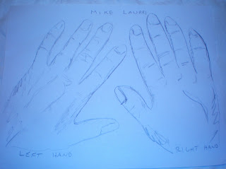
Week 9 Hand Drawing
Week 9 Hand Drawing:
1) Using my hand was something we did in school years ago, easy.
2) I used a pencil for this tracing. It is easy to shade.
3) Using my non-dominant hand was sloppy and messy. Hand looks fat.
4) Not really successful studies, very sloppy, I'm not a very good artist. Does not really look like my hands.
5) No way would i use my non-dominant left hand to draw. Too inaccurate and sloppy.

Tuesday, October 26, 2010
Week 9 Video Blog review
I picked the first 4 videos, of the Renaissance with artist, based in Italy. I did not pick the videos from northern European artists, not very interested in them. The videos were a good complement to the text, which happened to be pretty good for Michelangelo and DaVinci.
1) Drawings of Michelangelo. Before Michelangelo's paintings, sculptures, or architechure became art, he needed to make pencil drawings of everything. michelangelo made drawings of the Pieta, David, the Sistine Chapel ceiling, the Last Judgement, the Medici Tomb, and St Peters Basilica, among others. The problem is, he destroyed most of his original drawings. Some remain for study. Ghirlandaoi taught him to paint and draw, but his only signed sculpture was the famous Pieta with Mary and Jesus. He had a great knowledge of the human body, as seen with the David Statue, made in Italy in 1501. In 1508, he started the ceiling in the Sistine Chapel a very difficult job. This again was started with drawings. He then did the Medici Church architecture and sculptures, but he left it unfinished. Michelangelo's private life was confusing, and at the end, he did crucifixion drawings before his death.
2) Leonardo Da Vinci: The mind of the Renaissance: Yound Leonardo showed great promise in his youth, and was an apprentice in Florence. He was many things: a painter, a sculpture, architech, and engineer, a student of anatomy, a student of botany, and other sciences, a true "Renaissance man". He loved machines and how to improve them. He tried to be a military engineer by inventing war machines. He painted the Virgin on the rocks, but it took him 25 years to deliver it. He did some nasty human dissections, and made accurate drawings of them, including the muscles and ligaments. In 1499 Da Vinci left Milan for Venice, where he helped defend the city from invading Turks, even designing a underwater attack system. He eventually returned to Florence to paint the famous Mona Lisa. He has a lot of engineering designs that were never created for real. Da Vinci eventually moved to the Vatican in Rome, where he continued to work on inventions and research.
3) Power of Art : Caravaggio: What a strange video...very strange life of this artist. The Renaissance was a time where the catholic church tried to keep it's power and faith with the people, and away from the protestants. Protestants favored printed bibles, not paintings and sculptures. Caravaggio was a painter that used street people as models in 1593 Rome. He did not paint the classical styles with these poor people. The 'Boy with a Basket of Fruit' was of common people, as was the card game painting, done with amazing realism. The Calling of St Matthew was about a sinner, not a saint, and was a sacred success. The Martyrdon of St Matthew was basically a back alley fight. The Beheading of John the Baptist was a scene of horror and cruelty, instead of beauty. Caravaggio led a strange and tragic life.
4) La Primavera, by Botticella. This "Primavera" was beautiful painting of flowers, beautiful people, a magical, inspiring painting. It was made in the 1480's by Botticella. Venus and Cupid are in the painting, with other mystical people like Mercury. The painting may originally been a wedding gift, even with the themes of rape and violence, which does not make sense. It is difficult to understand the true meaning of the painting, with the 9 figures present, and it's erotic overtones. The Primavera is a popular painting in moderns homes all over the world.
All the videos were pretty good. I think the Caravaggio video was a little exaggerated with all the violence, and acting.
Tuesday, October 19, 2010
Week 8 Video Review Blog
1. More Human Than Human....this was a good video. Learned that the human body dominates the lives of people in art, but images don't really look like actual people, always exaggerated to look better. The 25,000 year olf venus of Willendorf is worth 60 million bucks, it exaggerates pregnancy since it was so valuable then. the Egyptians stopped exaggeration, they wanted consistency with art, it was a cutural value of theirs. They used grids to keep drawings of people consistent. The 1972 discovery of the Riace statues showed the greeks wanted perfect bodies, more god-like. These statues may be the greatest ever made. I like the mysterious music on the video when these statues were discovered. Greeks tried to work with the Egyptians, but could not. Kritios Boy was realistic, but decided to be boring. Since boring, artists went back to exaggerating. Even now a days, skinny unrelaistic models are the standard, same as bodybuilders. This was really a great video, liked it a lot, especially the riace statues, never heard of them before. better than text, as usual.
2. Birth of the Middle Ages. I have always been interested in the mysterious middle ages, so I picked this video, and the next 2 videos of the Middle Ages. Middle age feudalism still exists today in Cameroon. Japan maintained feudalism for a long time into the 19th century. The Dark Ages started around 500 AD after Rome fell, after 8 centuries of rule. No more official laws, ethics, art, stability, or learning. Superstition was popular. Medieval fortified cities were started. Some culture was maintained by monks. The Renaissance , or rebirth, was started in 1000 AD, and life improved, art flourished, many churches were built. Thhis video did not add too much to the text, did not really learn too much from it.
3. Art and Life in Middle Ages: Luttrell Psalter. I loved this video. Geoffrey Luttrell in 1345 gave his unbelievable prayer book to the monks. Very detailed writings and illustrations of life in the middle ages, but included confusing pictures of make believe monsters. These detail pictures are priceless, show things like farming, planting seeds, harvesting, making clothes, milling, games and parties, acrobats, feasts, hunting with falcons, jousting, crusades. there were also Bible scenes and 150 psalms. Saints were shown, including how they died. This was an amazing book, with amazing pictures. Never knew it existed. A great video.
4. Cataclysm: Black Death Visits Tuscany. A good video that described the horrors of the Black Death better than the book. Talked about Siena and Florence in Italy, very prosperous cities with business, construction, a good life. Then the plague hit in the the 1330's in China, and spread to Italy in 1348. the plague lasted 7 months and killed half of europe. Many people moved to the countryside to escape the Black Death. The "horrors of hell" were drawn in artwork by bartolo to show the plague. Incredible times, i like the video, learn more than the text.
Monday, October 11, 2010
Week 7 Video Blog Review
1. Key Concepts:
a) The Prairie Style Video did a nice job of showing Frank Lloyd Wright. His Prairie style housing design changed architecture. Previously, houses were segmented, with closed room, a Victorian style. Wright's design was organic, of the landscape. he like open, horizontal spaces. The fireplace was the main center point of the house. Many windows give a house an open look. The Tomak house was the first one with open spaces design. Many new houses now have open designs, instead of small rooms. Fallingwater used the cantilever design, with live waterfalls in the design.
b) Architecture: Science of Design: This video discussed skyscraper design. Even though they are steel and concrete, they still sway in the wind. Wind tunnel testing is done to help the design and prevent sway. Sometimes trees can be planted to prevent wind effects. Smart houses for individuals are taking over, instead of large apartment houses. Smart houses have all the energy efficient devices. Concrete is still the material of choice, as Greek and Roman concrete is still standing, it's found in all forms of architecture.
c) Classical Architecture: Ancient Greek and Roman classic architecture is used today, seen in places like Washington DC, and even in WWII Germany. Three Greek styles of Doric, Ionic, and Corinthian columns exist. The Arch was invented by the Romans, and helped allow larger inside areas. Prince Charles is leading the effort to get more classical construction instead of modernistic. Modern architecture uses solar energy, energy efficient windows, and other smart technology.
d) Imperial Rome was chosen: Rome was founded next to the Tiber river and the 7 Hill. The Servian Wall was built around Rome as protection, then eventually the Aurelianic Wall. Romans used stone for wall, bridges, and homes. Aqueducts were great construction projects in those days, and brought water to the city. Ostia and Portus were port cities and dock, used to receive and transport grain for the food supply of Rome. Romans had to live close to work, since they could only walk to work, so they built interesting 5-story apartment houses. Public latrines were constructed, and water was supplied with lead pipes. That is one problem I see with Rome, is the lead poisoning potential. Roman Palaces were great construction projects, as was the Pantheon temple (all the gods). The Pantheon had a special round dome, and was rebuilt at least 2 times.
2. The videos related pretty well to the text, but as usual, they were superior. Much easier to watch and learn for me.
3. I like the videos, especially the Frank Lloyd Wright, and I liked hearing Prince Charles talk in the cameo. I did not like the Science of Design very much, they spent too much time talking about wind tunnels and wind effects.
4. I chose the Roman as the 4th video. Mian reason is that I am 1/2 Italian, and I wanted to see something from my ancestors.
Sunday, October 10, 2010
Week 6 Installation Art
Step3 Questions
1. What is installation art? A space in a room, or outside, that can be entered, explorer, experienced and reflected upon. Placement is in exhibition space where people are invited inside. Most installation art is in a room.
2. Materials are everyday, common place items. Fabric, wood, lights, cloth...in my artwork, I used tin foil.
3. Why make installation art? It asks people to explore and experience. This is different than simply looking at a painting, or sculpture.
4. My favorite artist is definitely Christo and Jeanne-Claude. They hung the Gates in New York City. I will do a version of the Gates with my project.
Step 4 Questions:
A. Yes, I loved the gates by Christo and Jeanne-Claude. I want to hang a different material in one room, and see what happens.
B. The element I want to explore is Texture and Pattern, such a visual texture, this is apparent in the smooth, shiny foil I am using.
C. I will use sheet of tin foil
D. The installation is above a couch in the computer room of my house. It will partially enclose the couch, maybe even give a trapped feeling. The shiny appearance may give a futuristic feeling.


4. The installation is hanging tin foil above a couch, in front of a TV. You can experience the art by going behind the tin foil barrier, and looking from on the couch. You get a trapped feeling, caged in a way.
5. The shiney foil seems futuristic, like a science fiction event. I will leave it up all day to enjoy!
6. You have to plan by coming up with a general idea, then trying to find the ideal site. I wanted to do something like The Gates. If I did not find this perfect site, I would have selected a different project. This ended up being a fun assignment.
Wednesday, October 6, 2010
Week 6 Peer Response Blog
1) I reviewed the documents by Katherine Gruppo and Jenna Fanara, here are the links:
http://katieaed.blogspot.com/2010/09/first-blog.html
http://lostprofetsun.blogspot.com/
2) Overall, both students did a nice job with the elements and principles listed with the images. Katherine did a great job with 3-D "space" picture, and a black and white "Value" pic. Jenna has some amazing phoots of the outdorrs for the elements. All met the definitions.
3) For Project 2, no, the images were not the same as mine. It's a big museum, a lot of selection. I like the Niagara falls picture, but did not like the scary picasso womans' head. Both girls did a nice job with the photos.
4) I had a lot of interestin the beauty of the element pics by Jenna Fanara...absolutely beautiful color and settings. Must have been Letchworth park. Up close pictures of colorful flowers were awesome. She really captured the 'elements'. And I liked Katherine's 'Value' pic a lot, really looked like a professional set-up.
5) I liked reading my peers reflections, but I really liked looking at the pics...got more out the sheer beauty of the work they did.
6) None of my peers added to my blog at this time.
Tuesday, October 5, 2010
Week 6 , 3 Video Reviews
1. Thru the Eyes Of A Sculpture was a good video. It described how Emmanuel Fillion started sculpting at an early age of 15. He received a scholarship, education, and training. Initially he worked with restoration. He eventually became a master sculpture and moved to Malibu. To make the piece of art, he needs to draw it first. Then he makes a clay model, then he makes a plaster cast model. He picks out a piece of marble, then a helper makes a 'rough carve'. Fillion then finishes it with a file, and makes the final touches. It's hard to appreciate the level of difficulty in doing this work, it is not described in the text. They have to search for the limestone and marble, out in the mountains of Italy. It was a very good video, I learned a lot about limestone, marble, and sculpture.
2. Glass and Ceramics explained the glass making, and ceramic process. Glass is made from silica, and is actually a stiff liquid. It can be shaped into any form, and these days glass is being used in special energy saving applications. Glass is also being improved as safety glass to prevent injuries. Staind glass windows are made by starting with small-scale models. Then full scale sketches used as a pattern. Eventually you get a puzzle of glass to put together. The final beauty depends on surrounding light. The text does not do a good job of explaining as the video does, so much easier to watch a video. It was a decent video, but maybe a little old and outdated the way it presented.
3. The installation art video was interesting and a little weird. Installation art manipulates space and perception, and forces the viewer to evaluate the art in a 3-D look. It is called fashionable and trendy, but I call it a little weird. Installation art "takes over and defines space" by the artist. The invisible art of weird music playing for 1000 years is creepy. Marcel Duchamp is funny by calling everyday objetcs as art. Video cameras are now used inside darkened rooms, as art. Yes, this video is also better than the text, explains everything better. I liked this video the best of all 3.
Thursday, September 30, 2010
Week 5 Visit To A-Knox Museum
#1 is "ZimZum" by R. Harrington, 2010, charcoal on canvas
#2 is "Saw and Sawed" by N. Jenny, 1969 acrylic on canvas
#3 is "George Washington and 3 Indians", by John Wesley, 1963
#4 is "Disappointing Sunset" by R. Huntington, 2009
#5 is " Yo Yos" by W. Thielbaud, 1963, oil on canvas
#6 is "The Old mill" Van Gogh, 1888, oil on canvas
#7 is "La Musique" Mattisse, 1939, oil on canvas
#8 is "Study of a Nude dancer" Degas, 1878, bronze scupture
#9 is " The Walking flower" Leger, 1951, ceramic.
Question 1: Most impact or impression were from #2, 6, 7, the Van Gogh, Mattisse, Jenny. Van Gogh and mattisse were classics that are great to look at for a long time, and I also like the Jenny saws.
Question 2: A connection with #5, #4, #1, they all look so easy to draw and paint, I could probably do it. They do not look really professional, like the Van Gogh and Mattisse.
Question 3: I'd would like tolearn more about the George washington and 3 Indians...what was this supposed to mean? A political statement? And the 2 scuptures were kinda interesting...one was serious, one was playful.
#1

#2

#3

#4

#5

#6

#7

#8

#9

Wednesday, September 29, 2010
Week 5 Logo Design
1. Creating the logo was fun, although i did not know where to start, or what the final product would look like.
2. Creative skills were improving with each sketch. I kept thinking how to improve, or what new and interesting thing i could add.
3. The most important thing i learned is that i can be creative. Trust yourself, open your mind, and ideas will come.
4. I did not get too much out of the graphic design video, but I loved the Marmite video. When i think of a new corporate product, I don't think much about the human beings that are actually trying to figure out how something will work. Watching step-by-step creative action was great, in designing the squeeze bottle and special spout. I found myself hoping it would work. But I don't think I would like the taste of Marmite.

Monday, September 20, 2010
Week 4 Color Wheel, Value Scale Blog
1. The value scale and color wheel were fun to create, like we all did years ago.
2. I liked working with colors instead of just dark lead pencil. I used colored pencils, not paint.
3. Neatness was important, I was surprised that things looked a bit messy.
4. Good video, but there was no sound or narration. The video was good to show how rich primary colors are used to make secondary colors.

Saturday, September 18, 2010
Monday, September 13, 2010
Week 3 Color and Feelings Blog
1, Color has an effects on emotion. People have facorite colors for some reason they cannot explain. They will decorate their room in one color. Color theory involves primary, secondary intermediate colors, color properties of hue and value, and harmonies. All of these effect the human brain in different ways to get emotion involvement with color.
2. The aspect of color that insterests me is the human brain and color. Why is it that people can have a favorite color, what causes this?
3. In the Color video, the 'Assumption of the Virgin' was amazing. As were other old frescos. How the old artists painted on plaster with little equipment was amazing. They stored pigment in pig bladders until steel tubes were available. And the difficulty to get pigment was anothe rhurdle. I liked the video as they took the boat through Venice. Nice view of Venice.
4. The Feelings video was interesting when the artists switched from religious works of art, to 'human', or secular artwork. Things sometime got a little nasty, like Goya painting killers, witches, and David painting nasty stuff also. That transition changed the future of artwork, but I still like the old religious art.
Thursday, September 9, 2010
Week 2 Video reviews
1) The key concepts of both videos:
a) Aesthetics: Philosophy of the Arts thought it was important to see beauty in all of art. I discuss this more in question 3.
b) CARTA: neurobiology believes that people's response to art is a neurological brain reaction. I again discuss more in question 3.
2) I like Plato's contribution way back in the 5th century BC. He did a lot with what little technology he had to describe and push the arts ahead, in backward and violent times. He said about art: "there is a beauty by which all things are beautiful". He believed in the erotic appeal of beauty, but he had a low opinion of art in a traditional sense. Regardless, he set the stage for future philosopher's theory on art.
3) Changeux vs. Ramachadran
a) Changeau thinks art is a human artifact, a non-verbal type of language that humans naturally possess. That art that we have inside us is constantly evolving, and evolutionary process, deep in our consciouness. Art has a aesthetic efficacy, or effectiveness, depending on our consiousness. He also did some brain imagary studies which were interesting.
b) Ramachadran was a good speaker, a lot better than Changeux. Ram believes that human response to art is a neurological brain response. Sensory brain reactions occuring give us art appreciation. He has 8 laws of aestethics: grouping; peak shift principal; contrast; isolating single cue attention; perceptual problem solving; symmetry; abhorrence of unique vantage points; art as a metaphor. He explained each of his points. The point i liked best is when he explained why some beauty marks on the face are attractive and unattractive, using symmetry as the reason, it was a good demonstration. I did not like what he said about idiot savants could do art.
4. The videos were very good, way more in-depth than the textbook.
5. Overall I liked the videos and they add to the class. But the first one with Changeux was difficult to understand, and was not easy to download on my computer. The Ram video was off YouTube, and came in loud and clear. The Changeux seemed way too long to sit through, but the Ram video seemed to go by quicker, and was easier to watch...that's the different styles of the 2 presenters.
Saturday, September 4, 2010
Week 1 followup
Questions answers for week 1:
1. The process of Gmail and Blog creation were fairly easy. Just follow the procedure.
2. I expect to learn about art origins, and how to appreciate art more.
3. This is my first Buff-State on-line class, so far, so good.
1. The process of Gmail and Blog creation were fairly easy. Just follow the procedure.
2. I expect to learn about art origins, and how to appreciate art more.
3. This is my first Buff-State on-line class, so far, so good.
Tuesday, August 31, 2010
Subscribe to:
Posts (Atom)